

I'm finally back! I have been working everyday and I come home super tired and poopy. Everyone else is enjoying their holidays, while I am serving them their food. So I am finally back, I'm going to hold off sleeping tonight and do this post since I want to get this up already! I have been super excited about this collection when I saw it on Etude House's instagram photo of the Arctic Aurora collection. I'd have to say that their nail polishes in this collection is stellar, and after being wowed by the first pink bird box that came with three of their nail polishes, I fell in love with them. So I was super excited, waiting with anticipation to get the arctic aurora polishes but sadly they did not come in this month's box. :(
On the bright side, I got my second box bird box finally. I actually got this box about a week and a half ago already, but I got caught up with life so I didn't get to post it up in detailed pictures. If you want to see my latest upcoming posts or just random make up pictures, come visit me at instagram: Christinahello~ See you there! :D

If you want to check out my first Etude house pink bird box, click here! This is with the Pink tree collection where if you live in Asia and you buy anything from the Christmas collection, they donate 100 won to the Save the children foundation. So check that out!

I wonder what is inside :D. The email said we got a cool Christmas card and a Christmas gift. I had a slight idea what the Christmas gift was since I saw something super cool on the Etude house korean website.

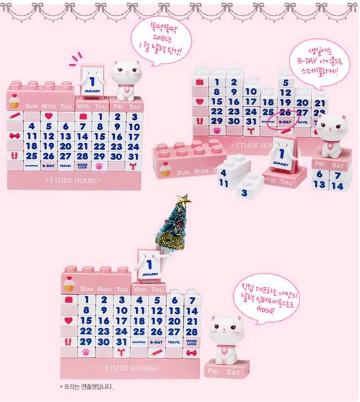
Yep, I was definitely right. It is the Etti calender!!!

The secret pink bird agent folder filled with another task! This month is the Arctic aurora collection and OHHH it is gorgeous!

Yes!! It is a gorgeous collection for sure! I'm sad still no nail polishes though :(. Maybe next time LOL.

The calender is sooo cute! I'm dying!

Ohh what is this!

So this is the card. IT IS SO PRETTY! This must be the prettiest card I have ever gotten.

One very obvious reason that I love Etude house is their princess themed products. I think their packaging isn't overly done or tacky, but tastefully designed, pretty and affordable prices. :) This card makes me happy!


Just look at this amazing collection! This is perfect for the winter time for sure.


So pretty! I really am not a nail girl but the colors are so pretty, I just want them all on my nails haha. That blue and light pink with the fine glitters is GORRRGEOUSSSS DARLING!

These are the eye shadows in the collection. I do believe these are limited edition shades, but don't quote me.


Let's talk about the calender shall we. I actually had to take a second batch of photos since the first ones were getting this weird blue tint in the white background and I was very unhappy about that. Especially since I can't fix it with photo editing and it just made the colors worse.

Here's the promo photo of what the calender is suppose to look like before I rearranged it to what it is suppose to be for January 2015. It is seriously weird that 2015 has already came! I remember when I went to finish my culinary journey of getting my Red Seal last January. This year seriously flew by!
Those little reminders would be helpful since I don't know why but I can not remember my parents birthdays. I sometimes don't even remember my own birthday since everyday is work, eat and sleep. I think everyone out there can relate.

I think Etti can be the new logo of Etude house. SO CUTE! UGH~~~~

I really wish I could understand Korean. I do understand a bit when I watch Korean drama, and I actually found that a lot Korea words are 90% the same as Cantonese! So weird. My ears perk up when I hear something I understand even though it is Korean haha. Slowly but surely I will learn Korean.

Here's what it looks like outside of the box. I wish American brands would do something this cool. We never get anything fun in North America >_>. And when we do have something fun, it is super overpriced. This calender priced at 8,000 won is perfect!!!

ETTI~~~ I like that there is also a little board holding the months. Someone asked me if there is numbers for the whole January since it says 1 above the January, but I think the number is representing January as the first month. For February, it would be 2 and so forth. I hope that makes sense...


Look at the detailing on this board. SO STINKIN CUTE. How many times have I said cute LOL. Sorry...

For the main event! The eye shadows for the Arctic aurora collection. Surprisingly, I got a variety of finishes such as satin, matte and duo chrome. YASSSSSS~

Like the face shop, their eye shadow packaging is also clear but very sturdy. These shadows retail for 3,500 Won (about $3.50 USD) to 5,500 Won (about $5.50 USD) depending on the different finishes.

Simple, clean and sturdy is definitely the way to go. Etude House still holds a near and dear place in my hoarder heart.

The first eye shadow is called "White night of arctic" (BK801), a cool toned lavender purple with fine gold shimmers. I'd say it gives a golden sheen more so then a glittery finish, which is quite nice and wearable for everyday. I can't seem to find this shade in the global Etude house site but I'm sure you can find it in other sites where they sell korean cosmetics :) (aka. testerkorea).

These swatches really don't do the shadows justice. I myself am very used to using high pigment, bright colors when I do my make up so it is slightly weird and awkward that these shadows are on the sheer side. I do understand that the Asian market prefers sheer washes of colors rather then the typical Americans since they lean more towards the natural, healthy look which I love myself but it is slightly weird for me to get used to sheer wash of colors.
The texture of this particular shade is soft and easy to use. I wouldn't try and blend this shade too much since it is already pretty light. I'd even just use my finger and pack the color on my lids for the best results.
In person, the white night of Arctic swatches sheer (how many times does this girl have to say sheer, we get it!), the slightly dark looking purple from the pan swatching into a light lavender color, overpowered by the golden sheen. I wouldn't use this shade to pair with other highly pigmented shades since it would get lost in translation, but this would be a nice wash of color over the lids by itself for that everyday look.
Out of the three ways you can use this shade (either dry, wet or with a primer), the best results are with a primer.

The second shade is "Tip of the iceberg" (GR705), a light turquoise shade with heavy sliver and fine icy green shimmers. You can find this shade under the Look at my eyes jewel (link is here) and it retails for $5.50 USD.

Again, the pictures does not do this shade justice but in person, this shade swatches more on the shimmer side.
The light turquoise color doesn't show up that well, but if you pack it on either with your finger or even use this shade wet and pat it on your lids, it will show up well.
You get the best results by wetting your brush and patting the shade on your lid as you can see in the picture.
The texture is not as buttery as the white night of arctic since it is a shimmery/ glitter shade, but it is still soft, blendable (although I would not blend with this shade but just pack it on) and there isn't much fall out.
This shade has the perfect name! It really reminds me of an iceberg in the Arctic. There is practically polar bears jumping out of the eye shadow. Okay I'm totally exaggerating but this collection is FABUUUUUUULOUSSS.
I wouldn't use this as an everyday shade since I want that "I woke up like this" look, but this would be perfect on top of a dark shade such as a matte black, a dark blue, pretty much anything matte and dark with this shade topped off. FLAWLESS~

Here's another angel of the shade. Hopefully you can see how jewel like this shade is with it's high shine, high glitter, and high sheen. Pretty :).

Third shade would be "Fruit sorbets" (OR205), a matte burnt tangerine color. You can find this shade under Look at my eyes cafe (link here) and it retails for $3.50 USD.

This picture finally does one of the shades justice LOL. I love my some matte shades since I'm not a very shimmery/ glitter person so this shade is perfect for my taste.
This shade I would blend with, use it all over my lids or a transition shade in my crease to warm up the other cool tone shades. Out of all five shades that were sent to me, this one has to be my favorite since it can easily be used in an everyday make up look.
The texture is the same as white night of Arctic, soft, easy to blend and no fall out.
Out of the three methods, with a primer or dry would all work. I wouldn't really recommend using this wet, since it gives you the same results as dry or with a primer so why go through all that trouble right?

The fourth shade is called "Igloo of Siberia" (WH902), a sheer light pink with a hint of lavender undertone. I thought this would be a matte light baby pink, but nope! Boy was I wrong! This is a iridescent light baby pink with a purple sheen and pink + gold + sliver shimmers. SO PRETTY. It reminds me of the northern lights. This shade along with the "tip of an iceberg" both reminds me of the northern lights. This also reminds me of ice fairies for some reason haha.

Again I am really sad that my camera can't capture the true essence of this shade, but this is the most unique shades I have in my hoarder collection. I don't have anything like this! This color also can be a color I would use in my daily everyday, neutral look. In the tear duct, in the center of my lids for that extra glow. As Beyonce says, FLAWLESS~
I also would not blend this shade since it could get lost. Rather then blending, pack this shade on with your fingers, use your pink if you want it on your tear duct.
Texture again is soft and has no fall out. Don't blend this shade!
Out of the three methods, I'd say use this with a primer and not wet or dry. This shade gets slightly patchy when used wet but best with primer.

In another angle for you to see the beautiful sheen. Fairies right! ;) Like sleeping beauty fairies.

The last shade is "Dancing aurora" (PK006), a duo chrome slightly brick reddish color with green and gold shimmer. I can't seem to find this shade on the global website either which is a shame since it is quite a unique color too!

This is a pretty accurate picture of this shade but I wish it could also capture the green sheen as well. We can't win it all... sigh. This shadow reminds me of a dragon's skin doesn't it? With the cool green sheen and the slightly burnt reddish orange color, I'd love to pair this with some neutral shades and this as a pop of color and sheen.
This shade I could blend out and I would highly recommend you do blend it since you don't want to look like a crazy women with this shade right smack on your lids. PLEASE BLEND!
Texture is the same as "Tip of an iceberg" soft, blendable and has little fall out. On the skin after applied, the high shimmer gives this wet looking skin with the gold, green and sliver shimmers and there is a mixture of fine shimmers and bigger shimmers. This has to be one of the prettiest colors I have seen for a long time. Even if you don't pack it on, you can just use this to top off a really dark shade to give a different dimension.
You'd get the best results with wet for sure, but with a primer is almost as good. Dry, not so much.

Can't capture the green sheen! Darn it!

All the shades swatches on top of NYX jumbo eye pencil in the color Milk (matte white) to see if the shades look different but they pretty much look the same LOL. Except for igloo of siberia which looks more pink on the white base. Pretty :).

Overall all the shades are pretty and they all have their own purpose but I wouldn't use these all together. I tried using all these shades in an eye look but some shades were too sheer to pair with the shimmery shades. I'd use these all with other eye shadows I have in my collection but I can't use these together. They get all muddled together. I did an eye shadow look using all these shades. They looked fine in person, but the camera couldn't pick up all the different shades so I had to give up :(. Sorry for no eye look.

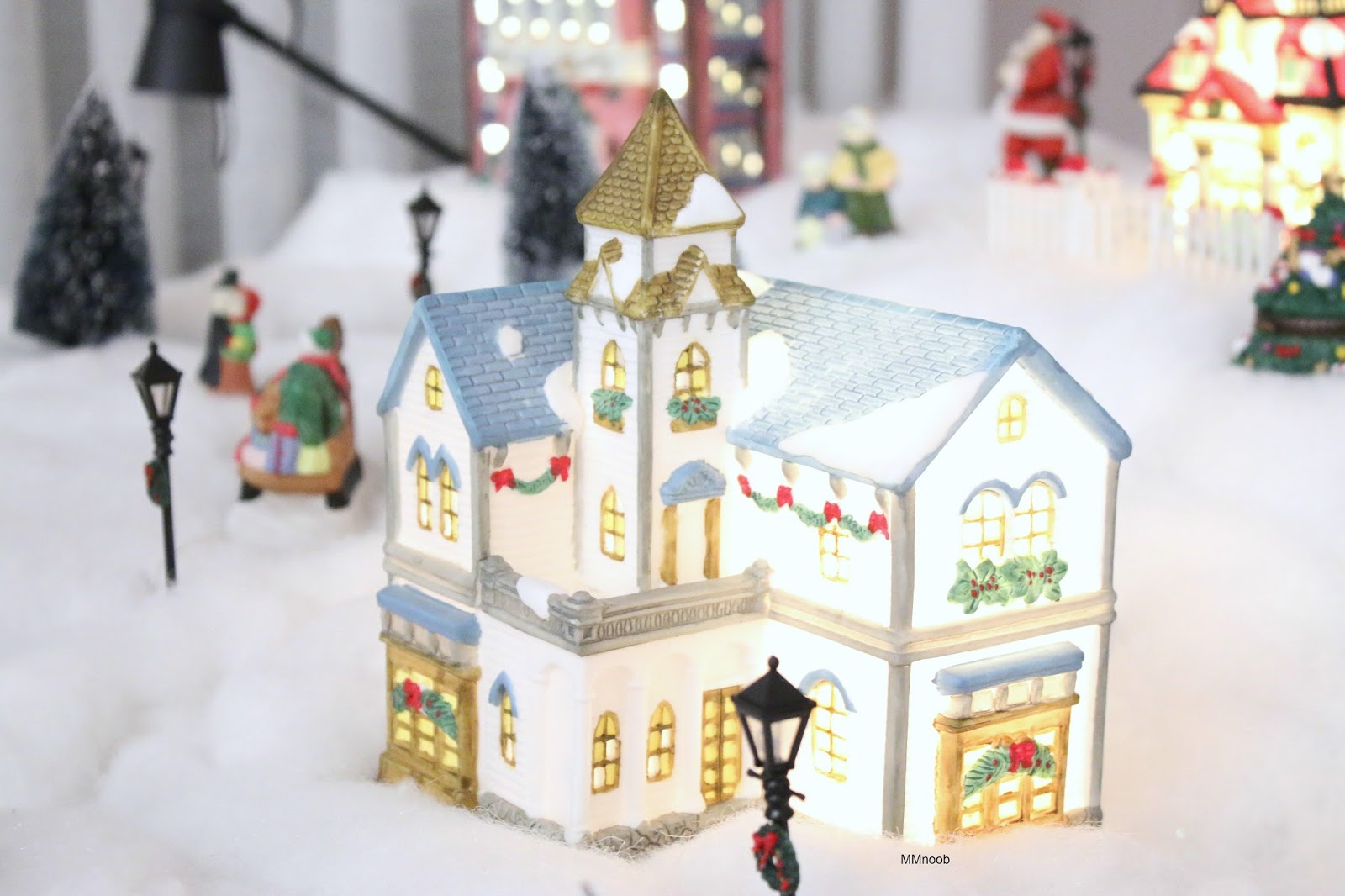
Here's some extra pictures of my decorated house for the Christmas time. Here's a way better picture of the pretty card they sent. I know I know, I'm totally late with this post and Christmas is already over :(. But I want to document what my house looked like after decorating the house myself since my parents didn't want to do it but I wanted a place to put the presents and its TRADITION! COME ON.

Etude house is part of my tradition, part of the family :). Thank you Etude house.


So Christmasy! I love it, until I have to take it down BLAH.

We even have our little village on top of our piano which no one plays anymore sadly :(.


Merry Christmas to all, and it is almost a Happy new year :). I hope you enjoyed my second pink bird unboxing and just embrace the holiday weight. I gained a few pounds too but I call it happy weight HAHA.

What did you guys do for your holiday? Did you go boxing day shopping because I sure did hehe ;). I will hopefully get my small and disappointing boxing day haul up after I do the 6+ awaiting memebox unboxings that has been sitting on my computer table for weeks now but they will be done after I get out of this holiday runt. Tell me how your holiday was, what did you get for Christmas, and something fun! I love reading long comments ;) and I promise I'll reply back. See you in my next post!
-Cheers, MMnoob
Love the way you've decorated your house, especially the little village. I'm going to save this post and show these pics to my sons who would love to experience a white Christmas once.
ReplyDeleteAww! There are these fake snow that comes in a can, and you just add water and it suddenly puffs up! It's super cool haha.
ReplyDelete